How I Sketch: Part Two, Demonstration
Continued from: How I Sketch: Part One, Materials

I thought it would be helpful to show and describe my own ‘how to sketch’ step by step process, but keep in mind that what works best for each person will vary widely. There are as many ways to create great sketches as there are artists.
When combined, ink line and watercolor create a lively visual interplay curiously pleasing to the eye. Playing with these two rather different media is a good introduction for those new to sketching: the results are fun, unexpected, and often wonderful.
When possible I do both the drawing and the painting on site. The painting can be done later, if need be, but I strive to complete each sketch on the same day for best results.
Sketches with areas that are not completely defined or finished are especially intriguing. The mind likes to have some work to do to fill in those gaps. To that end, I try to leave areas or portions of objects un-drawn, un-painted, or un-detailed.

Demonstration
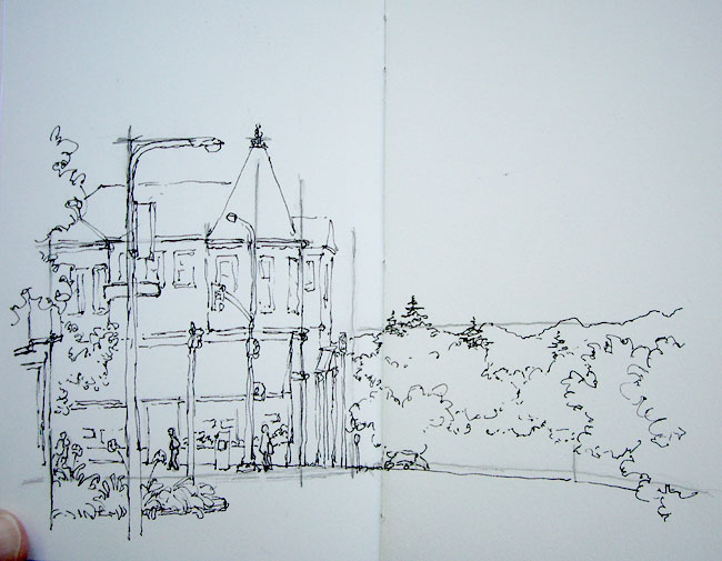
I did this sketch of a North Berkeley street corner (Shattuck Ave. & Vine St.) one morning last month while sitting in my car, taking digital pictures along the way. I have always liked this building, which houses a produce store on the ground floor, but had never sketched it. The lamppost banner also caught my eye; I like to draw scenes with flags, signs and banners. This sketch spans one spread (5″ x 7″) in my sketchbook and took about 30 minutes to complete, roughly split between drawing, painting, and waiting for paint to dry.
Drawing
The drawing is done with a fountain pen and waterproof ink. I try to stay loose; if I don’t like where a line ends up I just draw it again where I’d like it to be. Also, I find that a somewhat interrupted line adds flavor and a sense of light to the scene.
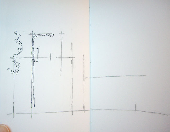
Step 1: Guide Lines

I rarely bother with this step but wanted to show every contingency. When the perspective of a scene is particularly tricky, or if I want to be sure to fit specific objects in a sketch, I will consider starting with some guide lines in pencil.
I take care that the lines are only positional cues and not drafts of the actual drawing; if I end up doing inking over completed pencil lines the results are stiff. I draw the lines lightly: these are shown heavy so you can see them.
Here, the guide lines note the positioning of the main building and its turret roof, the foreground lamppost, the line of the Marin County hills in the distance, and the street level. Streets are horizontal, but I felt like curving this one a bit; it seemed to help indicate that the block in the distance descends out of view.
Step 2: Foreground Objects

Although I don’t mind background lines occasionally showing through objects in from of them, I generally draw key foreground elements first to minimize this. Note that from my vantage point the tip of the foreground street lamp intersected the top of the turret roof and the top of the post’s banner lined up with the horizontal roofline. Compositionally this is awkward so I drew them with space in between. Artistic license, you see!
Step 3: Outline Main Shapes

I like to get all of the major shapes blocked in before adding a lot of detail, so that the overall structure of the drawing is established for later reference. Here I outlined the main building and the tricky roof sections using the pencil lines as guides.
Step 4: Fill In Foreground

Next I finished up the objects in the foreground. I like the plants on the median strip, so pulled them more into the view than they actually were and detailed them quite a bit. The building on the left doesn’t add to the scene (although it’s a great clothing store 🙂 ), so I didn’t put in a lot of effort there. I also inked in the line of the street on the left, deciding to curve it even more than I had originally indicated with the pencil guidelines.
Step 5: Details and Background

Once the basic layout of a sketch is established I start to fill in details. I tackled the building itself, working from large areas (upper/lower floors, awning) to smaller (windows, door). Although the blinds of the store were pulled shut, I knew that soon the windows would be filled with colorful produce so I put that in too. The scene seemed barren without any people, so I invented some figures. I also decided that adding a partially visible parked car would help indicate that the street descends out of view.
The background trees and the hills in the distance were then filled in, making sure that the pine trees clearly cross over the line of the hills in the distance to add interest to the skyline.
Step 6: Hatching

This step is relatively new for me, but I like the effect. I add hatching to indicate some areas that are in shadow. I do not hatch to indicate dark local color (the color something actually is: navy blue, for example, is a dark color), I just stick to cast shadows (in this sketch for example, under the awning) and the sides of objects that are dark because they are facing away from the light (here, the side of the building). I don’t spend a lot of time on hatching and don’t strive to be too accurate: I just get some in there.
After all the ink has dried (about 3 minutes), I erase my pencil lines.
Painting
Drawing provides structure to the sketches, and watercolor livens them up. I don’t so much paint my sketches though, as I tint them. My colors tend to be on the light side, and muted. This comes from working fast with a small travel palette, mixing pigments, and a lax attitude towards thorough brush and palette cleaning during the painting process. I put down one, and at most two, layers of paint in any one area. The smooth watercolor paper I use to facilitate drawing tends to create sharper paint edges and blotchier washes than traditional paper, but I like these effects.
Working small, I mix my colors on my palette rather than on the paper itself. Water, as needed, comes from my waterbrush. I almost always create a color with two pigments (and maybe a smidge of a third): one pigment is too saturated (except for flowers and manmade objects), and three or more generally creates “muddy” colors, dull and flat.
I don’t try to match the actual colors of things generally, unless color really distinguishes an object. Out of habit I tend to stick to a small number of pigments and mixes.
Typical mixes are:

- French Ultramarine+Burnt Sienna: blueish and brownish greys, and a soft black
- French Ultramarine+Permanent Alizerin Crimson: variety of lavenders (smidge of Burnt Sienna to mute)
- Cobalt Blue: water or sky
- Permanent Alizerin Crimson+Burnt Sienna: Brick-like hues
- Single pigments: Flowers, clothing, other manmade objects
- Raw Sienna, touch of Permanent Rose, sometimes smidge of Cobalt Blue or Burnt Sienna: Skin tones
- Raw Sienna: Sunlight on things
- any blue+any yellow: natural greens
Color theory is a whole topic unto itself, but I follow a general trend of colors moving from warm to cool, saturated to muted and dark to light as they recede into the background.
Painting is done loosely, allowing specks of white paper to show through and both under- and overshooting inked edges. The effect, something like an image printed off-register, adds vitality and sparkle to a line and wash drawing.
Step 7: Foliage

What to paint first? I try to pick whatever part of a scene I would like to have for reference when mixing other colors. I might choose the shadow areas, darkest spots, bright (saturated) areas of color, a very particular color I want to recreate, or areas that have colors that need to contrast well with adjoining areas.
In this scene not only is the building green, but there is a lot of green foliage as well; differentiating these is a challenge. One solution would be to make the building a different color, but the color of this building is part of its identity and charm, so I didn’t want to do that. I decided to paint the varying greens of the foliage first to serve as a reference when painting the building. I created a variety of greens using various mixes of French Ultramarine+Aureolin and Cobalt Blue+Aureolin in the foreground and French Ultramarine+Raw Sienna in the background. After the foliage was complete I let it all dry.
Step 8: Saturated Highlights:

Next I painted snippets of saturated color that I wanted to remain distinctive so that they would not be overshadowed later on. These included the people, newspaper box, flowers, store produce and street lights. I also decided to add redder color to some of the trees.
Step 9: Darks and Shadows
Next I considered the posts and parking meter. I decided to make the post directly in front of the building dark so that it would show well in front of the light building. I wanted to keep the parking meter light since it would be surrounded by dark shadows, and I decided the post beside it should be dark to contrast with the hills and trees beyond. I wasn’t sure about the foreground post, so left it unpainted for the time being. The posts were painted in French Ultramarine+Burnt Sienna grays and let dry.

Sometimes I paint an area’s basic color and then add the shadows on top when the first layer is dry, but more often I just paint the shadows in directly. Here I painted all of the shadows, hatched and un-hatched, except the lacy tree shadows on the building, with French Ultramarine+Alizerin Crimson+smidge of Burnt Sienna.
Step 10: Remaining Color
Next I painted the roof with French Ultramarine+Burnt Sienna. This is a large area in the painting so I made sure to apply it loosely. I did the roof in two coats: an initial pass and then once that dried, a second pass on some areas I wanted darker.
Now to tackle the building. I wanted a green that would be distinctly different from the natural greens in the scene, so I started with a bit of Phthalo Green. This pigment has an artificial hue not found in nature so I never use it for greenery, but it can be good for manmade objects that are green (like awnings and sun umbrellas). However, it is a very intense pigment so I just used a dab of it and added a bunch of French Ultramarine and water. I painted the building as loosely as I could, leaving the framing planks white.
Step 11: Finishing Up
It’s hard to know when to stop. At this stage I thought long and hard about what color to paint the awning. I couldn’t come up with any great ideas, so decided to just leave it unpainted and went ahead and added the lacy tree shadows to the front of the building and awning with French Ultramarine+Alizerin Crimson.
Given my decision regarding the awning, I decided to leave the foreground pole with its banner and sign white as well. Originally I had envisioned that banner being a bright, perky highlight of the sketch and it ended up quite differently, but that’s exactly what happens in the course of making a quick sketch. At any rate, in the spirit of leaving things undone it worked for me. I was pretty sure early on that I was going to leave the street white and that did prove to be true.
And So…
I hope this has been helpful. Lots of great, quite detailed, questions about technique have come my way in response to the first part of this series. I know I have not answered all of them as yet, and will continue to address topics related to both drawing and painting. If you have questions, please let me know, either by commenting here or sending me email, and I’ll do my best to address them.

Happy Sketching!
See Also
How I Sketch: Part One, Materials
Recent Sketches
Posts on Travel Sketching
Related Topics: Berkeley, How to Sketch, Landscapes, Travel Sketching
Leave a Comment
![]()
![]()
![]() Comments:
Comments: ![]()


October 9th, 2016 at 11:38 am
What beautiful work. I have tried so often and I don’t know when to quit. This absolutely touching. I can see your street corner. I haven’t read the rest of your blog yet. And I am entranced with your work.
April 25th, 2016 at 3:38 pm
Thank you. This is great. I am new to this and have been paralyzed by all that I have read and feel overwhelmed in executing …”what I should be doing”.
Your approach is so doable. It is clear, I can work it out by following your steps, and using it to guide myself through the learning process. Definitely the best demo I have found. Thank you1
January 21st, 2016 at 10:18 am
Fantastiiiiiic i loved your work and thanks for describe for us how you do your work, thanks a bunch.. I am an artist too and i may start to try sketching often i think 🙂
May 7th, 2013 at 11:55 am
Great job.. it’s fantastic you stile… ;). “Moleskine Reloaded” it’s great too… 😀
September 10th, 2012 at 12:39 am
Thank you so much for this posting! It really clarifies a lot of questions in my head! You have a very nice blog, I’ve just discovered this place, so I have a lot to read!
Thank you once again
Cristina
September 9th, 2012 at 11:33 pm
Thank you so much for this posting! It really clarifies a lot of questions in my head! You have a very nice blog, I’ve just discovered this place, so I have a lot to read!
Thank you once againm
Cristina
June 2nd, 2012 at 8:22 am
Other tools: Daler-Rowney sketchbook, “Ebony”, 160gm2 (they will deliver anywhere in the world); radio with earphones to zone out distracting stares from onlookers; pencils from 2B – H.
June 2nd, 2012 at 8:18 am
Paper: I am in Mauritius and I had my sketchpad sent to me from South Africa, but there will definitely be someone somewhere who will send it to you. It is by Daler Rowney and called Ebony and is 160gm2. I use A3 size as any smaller is very restrictive. It is super-smooth and is just about heavy enough to take watercolour. Obviously watercolour paper is better for the paint but it’s so expensive – which can be off-putting if you are cheapskate like me. Other than that…I find plugging in my radio into my ears is invaluable as it helps me “zone in” – especially if someone is hanging around, which can be very distracting.